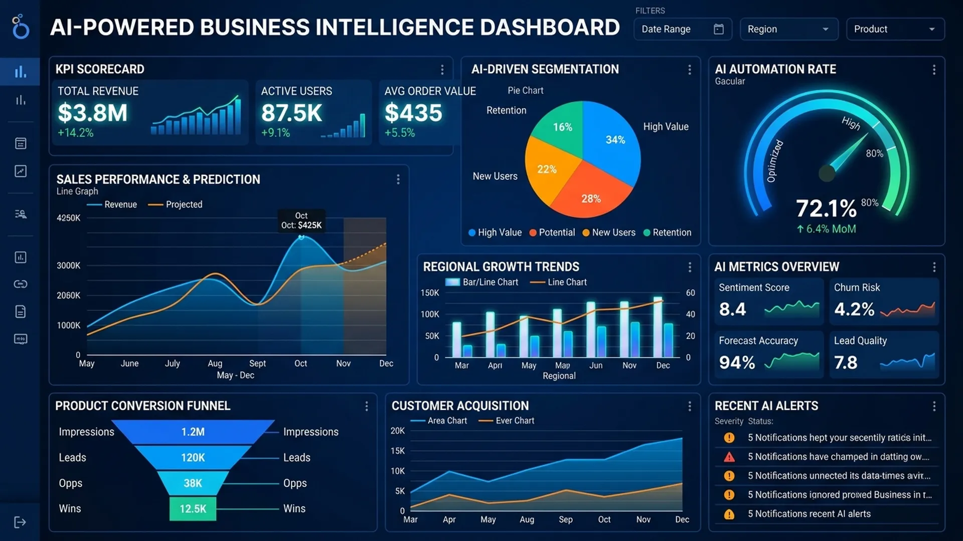
BA doesn't need to be a data analyst to build a dashboard. With Looker Studio or Power BI, if you know what data to track and why, you can create a useful dashboard in a few hours.
1. Metric Framework for an AI Feature Dashboard
BA needs 3 layers of metrics:
Layer 1: Business Outcome Metrics
"Is the AI feature delivering value to the business?"
| Metric | Description | Example |
|---|---|---|
| Automation rate | % of requests AI handles autonomously | "AI self-resolved 73% of tickets" |
| Time saved | Time saved vs manual process | "Reduced by 4.2 min/ticket" |
| Error rate post-AI | Error rate after AI was introduced | "Dropped from 12% to 3.5%" |
| Cost per outcome | AI cost vs manual cost | "$0.03/ticket vs $1.20 manual" |
Layer 2: AI Quality Metrics
"Is the AI working correctly?"
| Metric | Description | Alert Threshold |
|---|---|---|
| Accuracy (rolling 7d) | % of correct predictions | < 85% |
| Human override rate | % of cases where agent had to override AI | > 25% |
| Confidence distribution | Histogram of confidence scores | Shift > 10% |
| Latency P95 | 95th percentile response time | > 3 seconds |
Layer 3: Operational Metrics
"Is the system stable?"
| Metric | Description | Alert |
|---|---|---|
| API error rate | % of requests returning errors | > 1% |
| Queue depth | Number of cases awaiting human review | > SLA capacity |
| Throughput | Requests/hour | Drop > 50% from baseline |
2. Dashboard Design for Different Stakeholders
2.1 Executive Dashboard (Monthly Review)
Audience: C-level, Directors
Purpose: ROI and business impact
Keep it to: 4–5 numbers + 1–2 trend charts
┌─────────────────────────────────────────────────────┐
│  AI Feature Health Dashboard — [Month YYYY]         │
├─────────────┬─────────────┬────────────┬────────────┤
│  Cases      │  AI Auto    │  Time      │  Cost      │
│  Processed  │  Handled    │  Saved     │  Saved     │
│  12,450     │  73%        │  847 hours │  $34,200   │
│  (+8% MoM)  │  (+3% MoM)  │            │  vs manual │
├─────────────┴─────────────┴────────────┴────────────┤
│  [Trend Chart: Automation Rate over 6 months]       │
└─────────────────────────────────────────────────────┘
2.2 Operations Dashboard (Daily Monitoring)
Audience: BA + Ops team
Purpose: Detect issues early
Include: Real-time metrics, alerts
Key widgets:
- Live accuracy (rolling 24h)
- Human override rate today vs last week
- Queue depth + SLA breach count
- Error rate + latency
2.3 Sprint Review Dashboard
Audience: Dev team + PM
Purpose: Sprint progress
Include: Stories done vs planned, bugs found, AC coverage
3. Tool Comparison
| Tool | Strengths | Limitations | BA Fit |
|---|---|---|---|
| Looker Studio (Google) | Free, easy Google Sheets integration | Limited visuals | ✅ Great for quick setup |
| Power BI | Powerful, Office 365 integration | Paid, steeper learning curve | ✅ Great for enterprise |
| Metabase | SQL-friendly, self-hosted option | Requires DB access | ⚠️ Need tech help for setup |
| Tableau | Best visuals | Expensive | ❌ Overkill for BA |
| Grafana | Ops/ML monitoring | Too technical | ❌ Not for BA |
4. Step-by-step: Looker Studio for BA
Step 1: Identify your data source
Ask Dev to export logs to Google Sheets or BigQuery:
Columns needed:
- timestamp
- request_id
- ai_prediction
- confidence_score
- human_override (true/false)
- override_reason
- resolution_time_seconds
Step 2: Connect the data source
Looker Studio → Add data → Google Sheets (or BigQuery)
Step 3: Create the necessary charts
Chart 1: Scorecard — "Automation Rate"
  Metric: COUNT(WHERE human_override = false) / COUNT(*) × 100

Chart 2: Time Series — "Daily Accuracy (7-day rolling)"
  Dimension: Date
  Metric: % correct predictions

Chart 3: Bar Chart — "Top Override Reasons"
  Dimension: override_reason
  Metric: COUNT(*)

Chart 4: Gauge — "Today's Override Rate"
  Reference line: target threshold
Step 4: Set up automated refresh
In Google Sheets: Tools → Apps Script → setTrigger(daily refresh from DB)
5. Dashboard Governance
BA needs to establish:
| Rule | Description |
|---|---|
| Owner | Who maintains the dashboard? (usually the BA) |
| Refresh rate | Daily/hourly/realtime depending on the metric |
| Distribution | Who receives the email summary? (weekly) |
| Review cadence | Metric definition review every quarter |
| Alert routing | When an alert fires, who receives it and what do they do? |
Conclusion
A dashboard isn't data analyst work — it's a BA communication tool. The goal isn't beauty or complexity; it's the right metrics, the right audience, the right frequency. A dashboard with 5 charts that is checked every day is worth more than a 20-chart dashboard that nobody opens.